Application layout
When opening Cloud Admin the main screen will look similar to this:
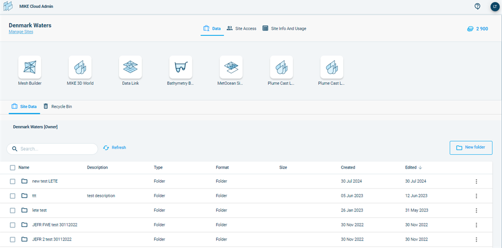
At the top of the screen there’s the Main navigation with the name of the application (MIKE Cloud Admin) and on the right the icons:
![]() Help and Support: find information about the application here, as well as options to ask for further support if the documentation is insufficient to help with your queries.
Help and Support: find information about the application here, as well as options to ask for further support if the documentation is insufficient to help with your queries.
![]() The dark blue dot indicates the initials of the logged in user. From this dot is it also possible to log out.
The dark blue dot indicates the initials of the logged in user. From this dot is it also possible to log out.
Underneath that is the Site navigation bar: it displays the name of the Site you are currently viewing (Danish Waters) with a site manager “Manage Sites” beneath it, and the Site tabs the user has access to in the middle of the banner (with Data being the currently active one, hence underlined) and credit icon with the total number of available credits for the site on the far right side of the banner.
Beneath that is the Application bar, showing the Cloud Applications in the subscription (and filtered by any Site settings). You can navigate to the different applications by clicking on their icon. They will open in a separate tab of the browser.
Underneath that is the Site Data. This whole segment is dedicated to showing, managing, and using data.
You can learn more about the site and data management as well as credit management features in the following chapters.