Nodes selection

The quality control tab is used to select the events (defined here as nodes) which will be simulated and from which the long term timeseries will be reconstructed. It is also used to plot the selected events against the full timeseries.
The selection of events is done by first reducing the dimensionality of the data and then selecting the maximum dissimilar events. The dimensional reduction is required to reduce the high number of dimensions in the boundary and forcing data (355 as described in previously) to a more manageable format. This procedure is described in more detail in the Scientific description.
By default, 10 dimensions and 100 nodes is selected. After clicking “Apply settings” the user has to wait about 20 minutes for the dimensional reduction to complete (considering the long timeseries of data used in this example). At completion, the explained variance is shown in the interface (see figure below). The explained variance depends on the number of dimensions selected, the duration of the timeseries and the resolution of the boundary conditions.
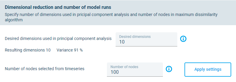
Default settings for dimensional reduction. The variance of 91% is shown after the “Apply settings” has been clicked. This process can take 20 minutes to complete.
The user should aim for an explained variance of above 98%. If the number of nodes is updated to 35 and the and “Apply settings” is rerun, then the explained variance increase up to 99%, as shown in the figure below.
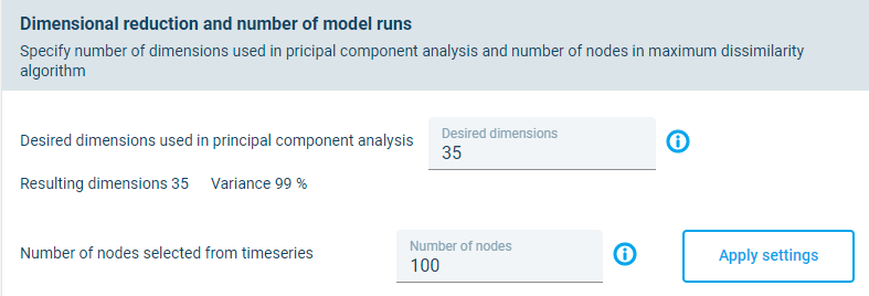
Updated settings for dimensional reduction showing an explained variance of 99%.
At the bottom of the page in the Nodes selection tab, the user can make timeseries and scatter plots of the boundary conditions data by changing the input fields. Thes plots show the selected nodes against the full timeseries. An example plot showing the Significant wave height for Boundary 4 is shown below.
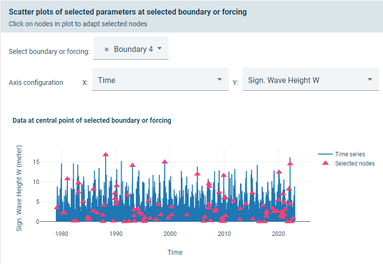
Selected nodes (red) from the timeseries data (blue) for the centre of Boundary 4.
Additional nodes can by manually added by clicking on the plot. Here it was decided to select any peaks where the significant wave height on boundary 4 is above 14m, as shown below.
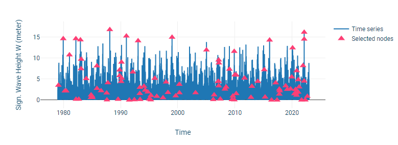
Additional nodes selected by clicking on the chart. Peaks above 14m was selected.
Nodes can also be selected manually for the other wave boundaries, for the wind and for the predicted water level if required.
Example scatter plots of Significant wave height against peak wave period and mean wave direction is shown in the two figures below, respectively. These plots can be used to identify any additional events that the user would like to add to the set of selected nodes.
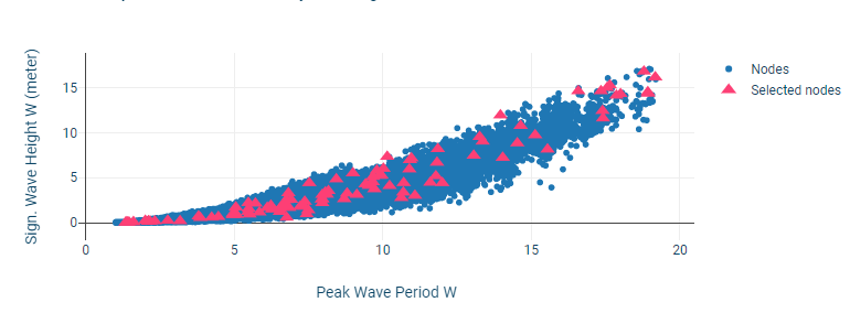
Scatter plot of Significant wave against peak wave period.
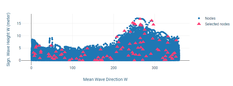
Scatter plot of Significant wave against mean wave direction.
When completed, the user can click “Next step” to proceed.