Ecological Scenario results visualisation
If the scenario execution finishes successfully, the scenario’s status changes to “Completed”. In this case, the “Results” button becomes activated, and you can press on it to see the scenario results.
The results page has three (3) sections, indicated by three tabular buttons in the top left part of the page:
- Animations: Time varying 2D map results
- Statistics: Statistical 2D map results
- Monitoring: Timeseries graph results

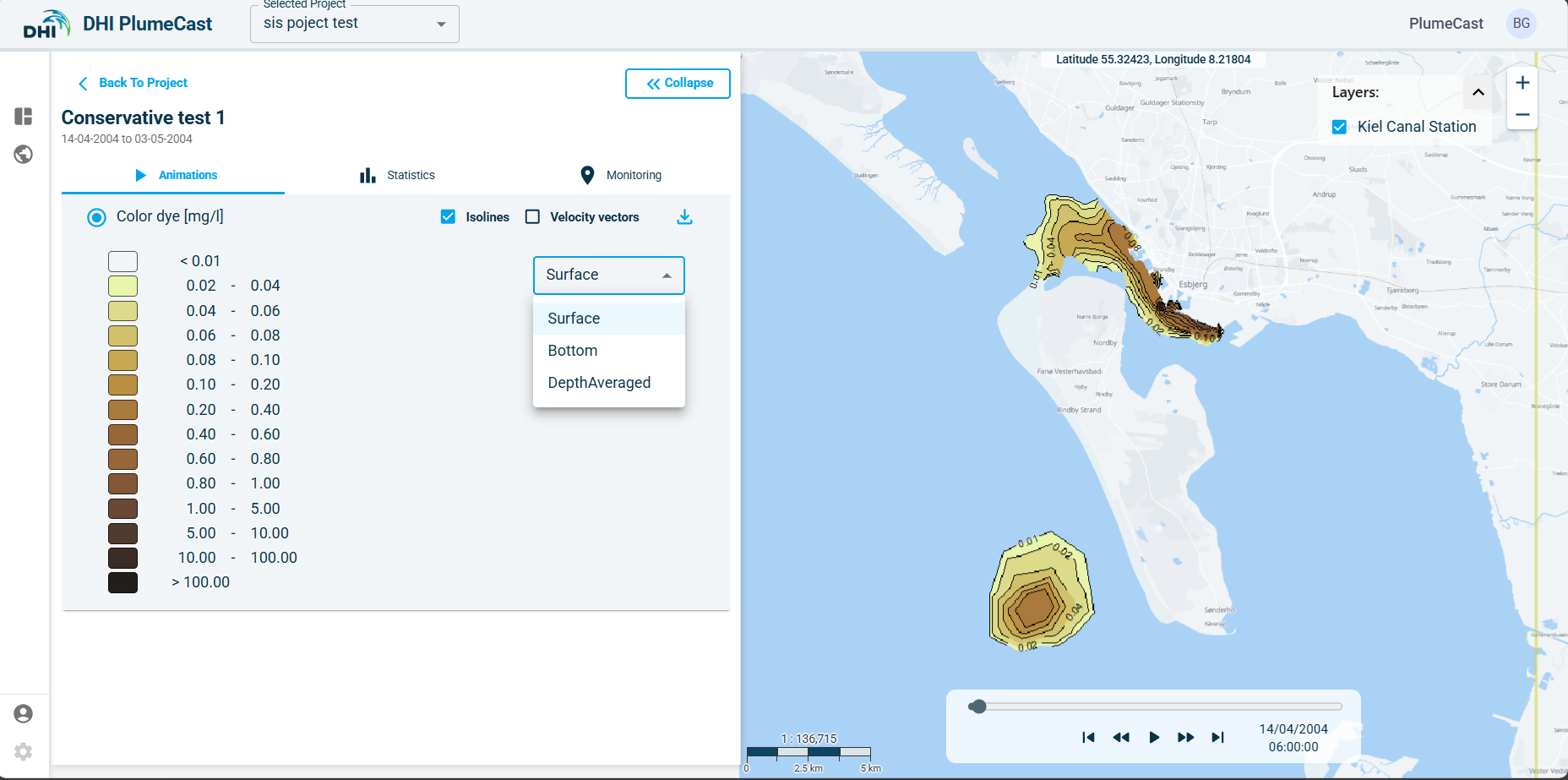
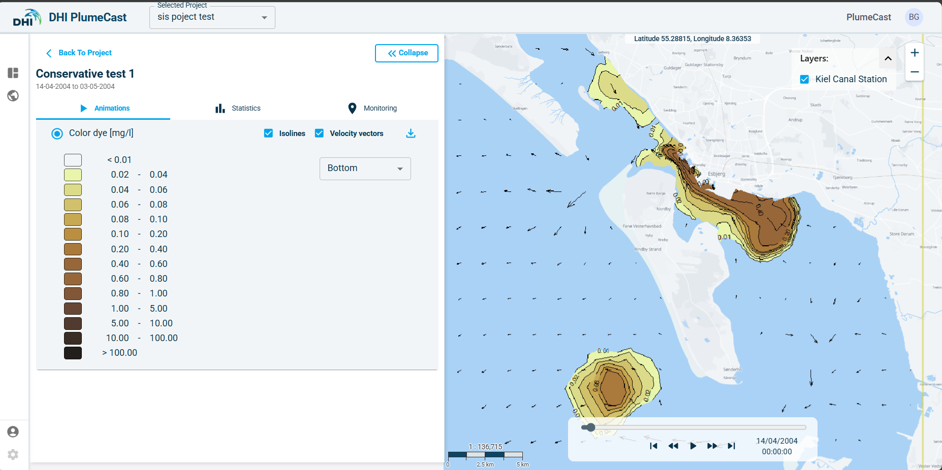
Time varying map results (animations)
In this part you have access to the map results of the following parameters, based on the type of contaminants defined in the scenario:
-
Contaminant of type Conservative tracer:
- Concentrations of all contaminants in water defined in the scenario
-
Contaminant of type Bacteria:
- Concentrations of Bacteria in water defined in the scenario.
-
Contaminant of type Environmentally Hazardous Material:
- Dissolved concentration of the contaminant in water
- Adsorbed concentration of the contaminant in water
- Concentrations of the suspended solids in water
- Dissolved concentration of the contaminant in seabed
- Adsorbed concentration of the contaminant in seabed
- Solids (sediments) mass in seabed
If the domain’s model is 3-dimensional, you have access to surface, bottom, and depth-averaged maps of concentrations in water. If the domain’s model is 2-dimensiaonl, you only have access to depth-averaged maps for concentrations in water.
By using the slider at the bottom of the map, you can play the animation or move backward forward in time. You can activate/deactivate the isolines and the current vectors arrows on the map. You can download the results as shapefiles by clicking on the download icon in front of each parameter.
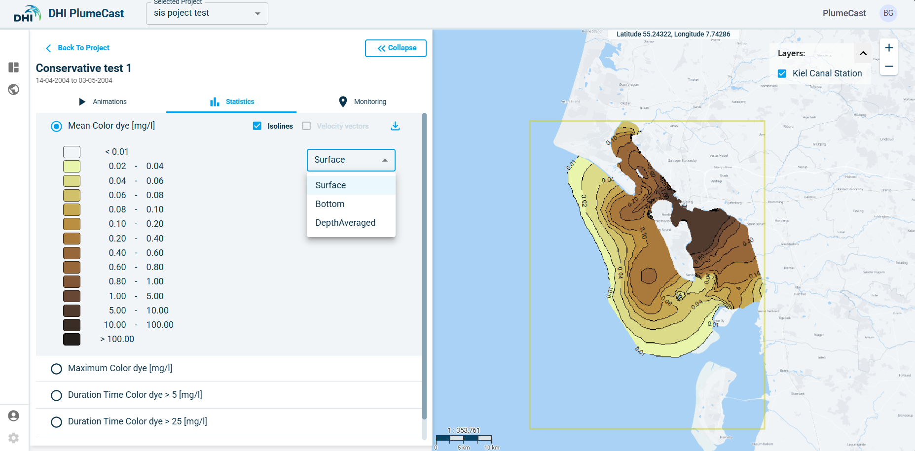
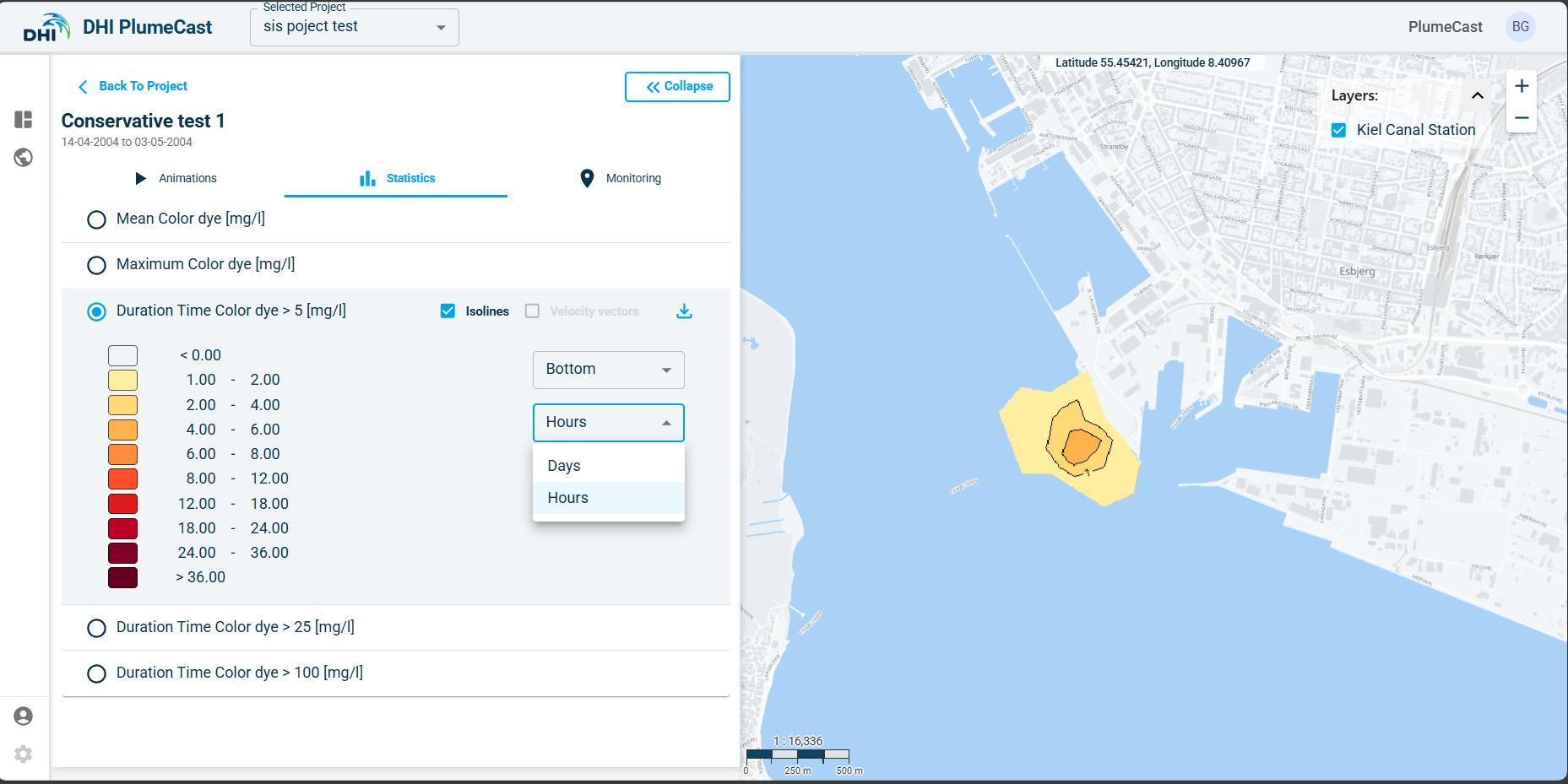
Statistical map results
In this part you have access to the map results of the selected statistical parameters within the scenario. Statistical analysis only is done on concentrations of contaminants in the water, i.e., the tracer concentrations, the bacteria concentrations, and the hazardous material dissolved and adsorbed concentrations in the water as well as the suspended solid concentrations. The available types of analysis are:
-
Mean concentration.
-
Maximum concentration.
-
Duration of exceeding concentration above the defined levels in the scenario.
If the domain’s model is 3-dimensional, you have access to surface, bottom, and depth-averaged maps for all the above parameters. If the domain’s model is 2-dimensional, you only have access to depth-averaged maps.
Timeseries graph results (Monitoring tab)
In this part you have access to the timeseries graphs generated by extracting data at the defined Monitoring Points in the scenario, and the timeseries graphs of the calculated discharge rates across the defined Monitoring Lines in the scenario.
In the Monitoring Points section, all the monitoring points extracting concentration values are plotted in the same graph. Monitoring points extracting current speeds and directions are plotted separately in different graphs (because values with different units cannot be plotted in the same graph).
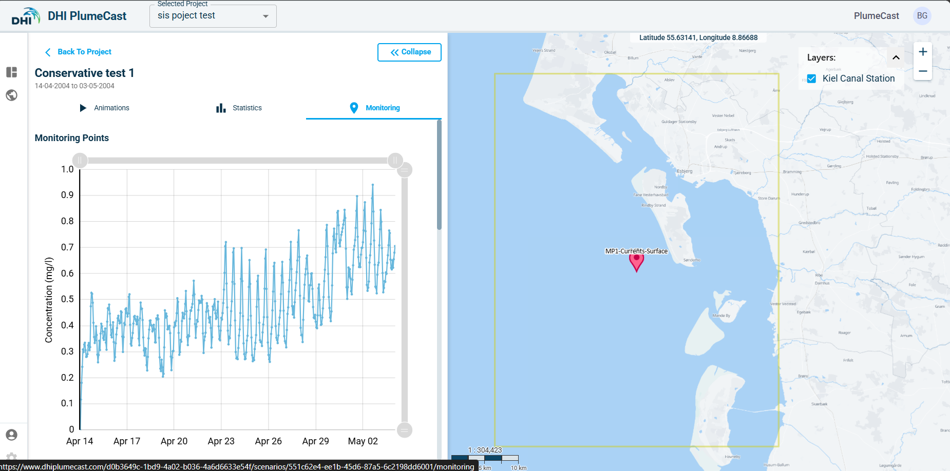
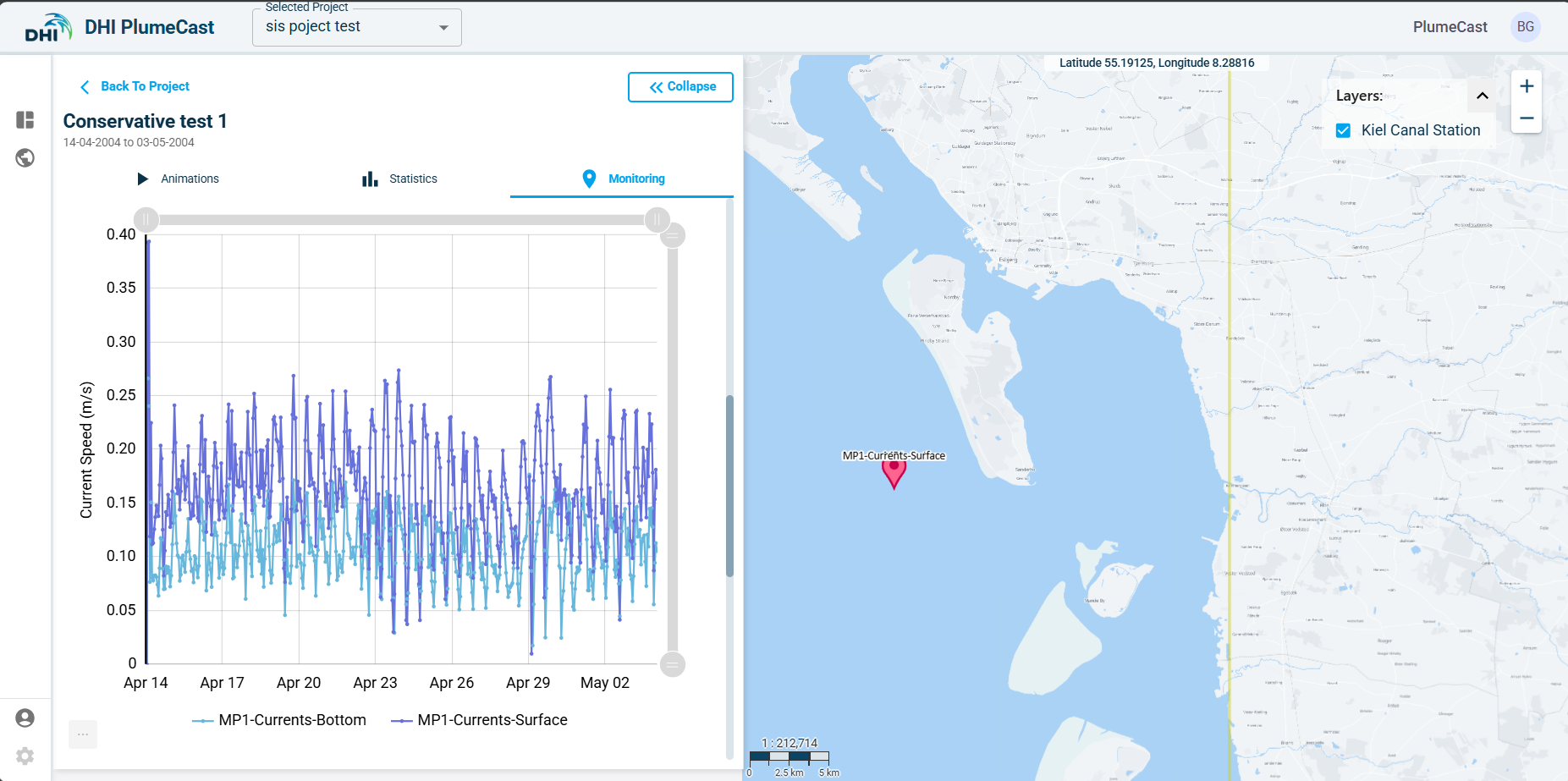
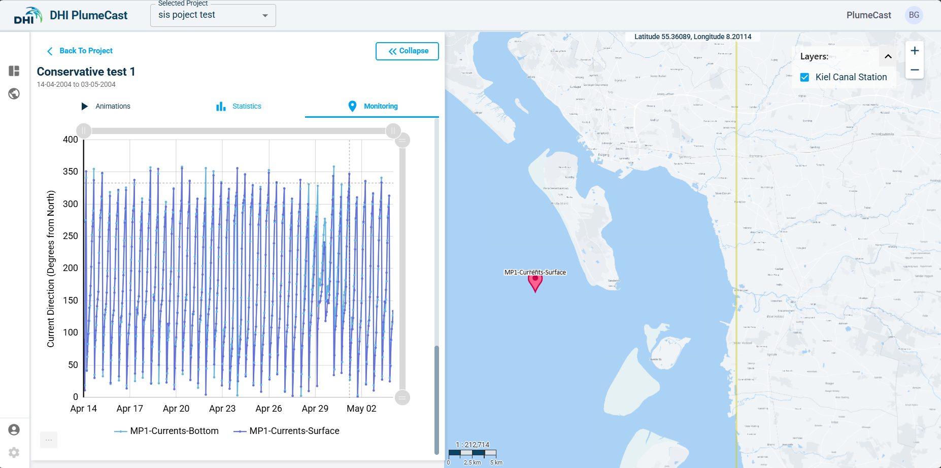
In all the graphs, you have the possibility to turn on/off any of the timeseries plots inside the graph. You can use the handles on the sides of the graphs to zoom in and out. You can download the graph as an image or send it to your printer. You can also download the graph as an excel file, which will contain all the data points available in the graph.